
Chelsea Town
Product Designer
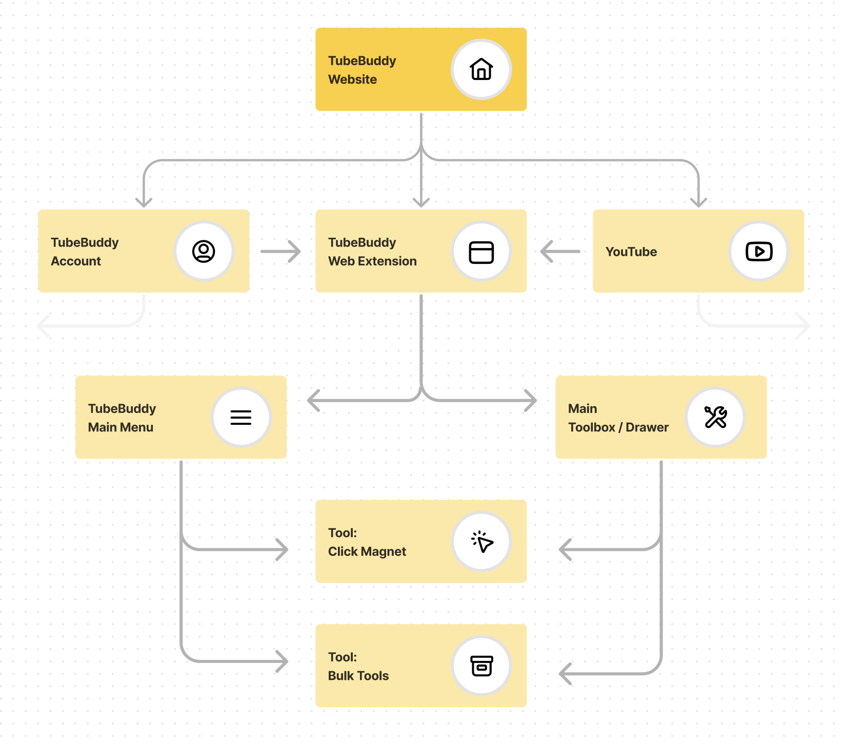
YouTube
Web Extension
One of the two most popular YouTube extensions
used by Influencers to grow their channels

Project Goals
By modernizing the Chrome Web Extension, our team strove to enhance confidence in the YouTube Influencer market and drive higher engagement with paid subscriptions. Additionally, this update would help reduce user churn, building a more loyal and satisfied customer base.
Discovery & Research
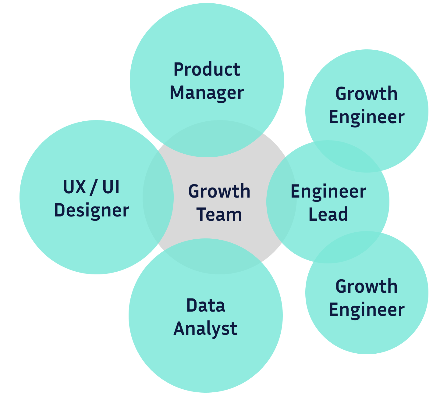
Cross-functional Team
Our six-member cross-functional team wanted to modernizing the extension. Each member understood their specific roles and responsibilities, enabling the project to progress seamlessly and increasing the likelihood of achieving clear and conclusive results.- Interview users to understand their perspective and opinion of prototypes
- Designer creates an updated version of each feature according to the company Design System
- Development scopes the lift of the project and estimates timeline
- Product Manager set the project roadmap
- Data Scientist defines the control and treatment metrics to measure success
- Developers break the project into epic and tickets
- Work begins!
What do Influencers want?
When evaluating changes to a feature, I prioritize seeing the product through the eyes of the user. Influencers would conduct their own cost-to-value analysis, often experimenting with the free version to determine if it would provide the increased performance they need. Many YouTubers juggle content creation as a secondary job, which means they may have limited budgets and time. Therefore, it's crucial that our system is easy to use and delivers clear value.Enhancing the company's user experience not only generates revenue but also strengthens YouTube channels by extending their audience reach. With this goal in mind, I constantly ask myself: "How can I make this easier to use?", "How can I make this more visually appealing?", and "How can these improvements drive revenue for the company?". When all three questions are addressed, users benefit from a top-notch experience, and the company enjoys increased sales and greater customer loyalty.
Design & Color Guides
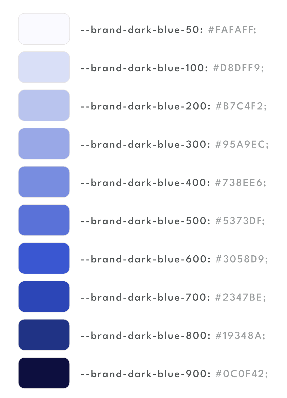
One challenge we encountered while transitioning out of its startup phase was establishing a stronger design system. This resulted in inconsistencies, which a proper design system strictly adheared to would fix.Because of how many tools the extension had, it would not have been efficient to redesign everything at once. Instead, we approached the redesign incrementally, starting with common design standareds like colors and variations, fonts, border radiuses, bullet points, active and hover states, and more. This foundational detail made the work of the designers and developers much more coherent.
By using a design variable system it saved developers time and was an targeted use of technology. This system ensured that developers could consistently apply the correct branding across the entire website and extension. It was particularly effective for creating a dark mode version, as switching between light and dark modes was streamlined to a simple conditional toggle.
Redesign & Modernize
Tool Redesign:
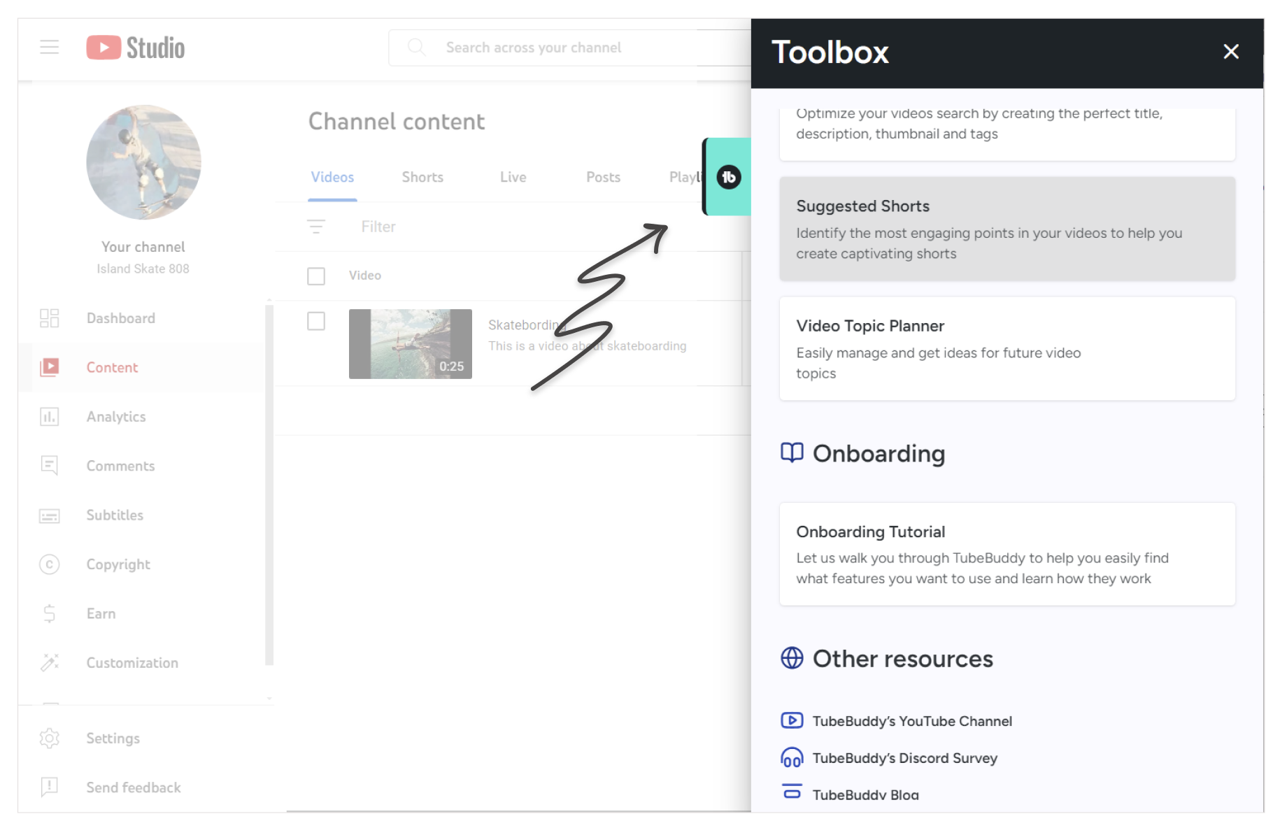
Toolbox
Creating a toolbox for YouTube Studio was a complex project. While another team had developed a toolbox in different coding language, our team was tasked with building a similar toolbox that would be integrated across every page of YouTube Studio and built in a new framework.
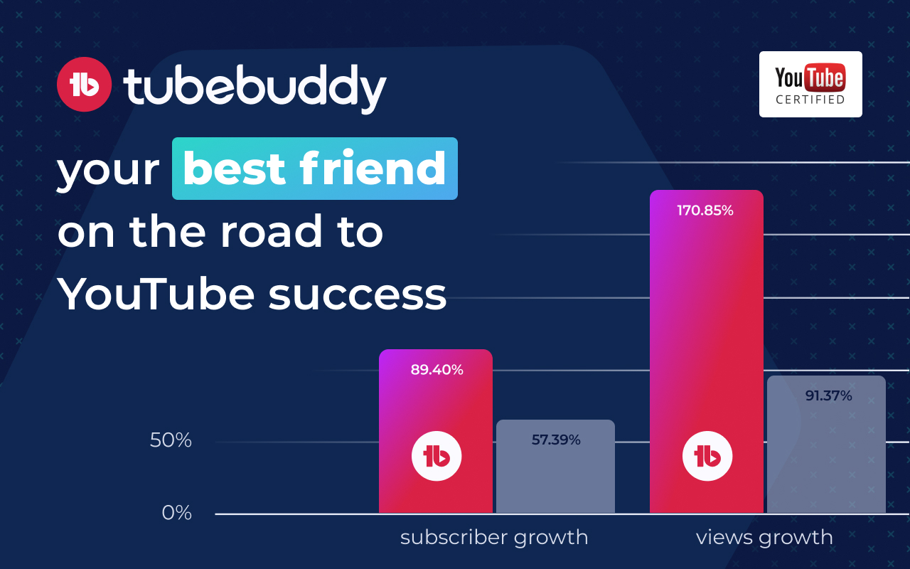
My colleague and I took on this project together. The initial design phase and foundational work occupied about half of our time. The remaining time was dedicated to building the toolbox to meet design specifications and adding data analytics, which were charted in a popular tracking tool. After testing the product, and then launching it to Production, the results demonstrated that the time investment was well worth the effort.
Results:
- More daily active users engage with its features
- Higher user conversion lift
- Large engagement lift for four key tools
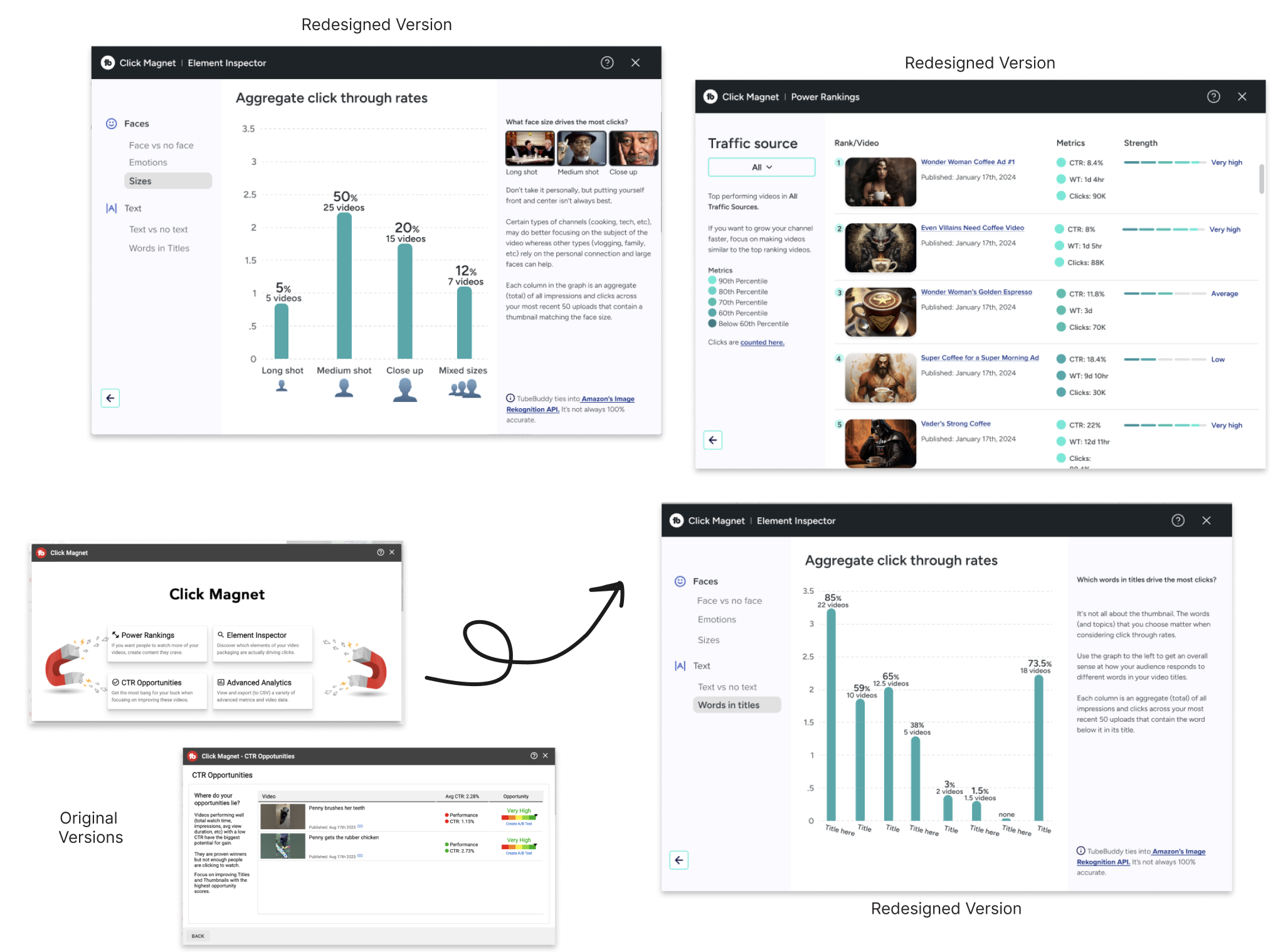
Tool Redesign
I spearheaded a tool redesign project from inception to completion. Tasked with evaluating and selecting three potential projects, I identified this tool as the most challenging due to its complexity and its significant usage within the toolkit.To initiate the project, I divided the tasks into approximately detailed Jira tickets, providing a estimate of the build time, including design updates, QA, and final team requests. The tool featured two landing pages with various error states and four primary features, each with its own subsections.
By effectively breaking down the project, I provided the project manager with an accurate timeline and met the delivery timeline. The peer reviews resulted in minimal updates and fixes.
Results:
Users experiencing the Click Magnet redesign had a significant increase in subscriptions rates.
Tool Redesign:
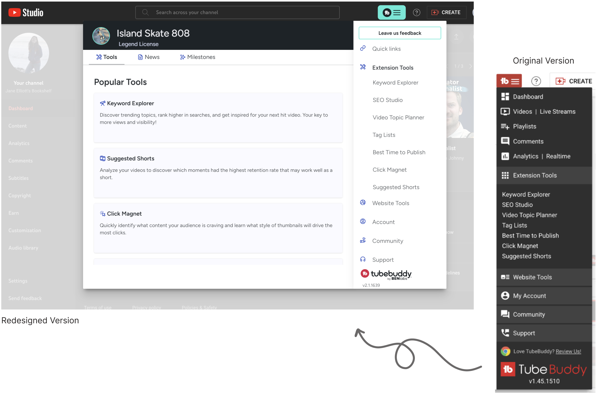
Main Menu
The main menu is a prominent feature of the web extension, being the first element new users encounter upon downloading the product. It required a complete overhaul. The user interface was significantly outdated and in need of thorough cleanup to improve usability and aesthetics.
To rectify this problem, our team developed a detailed plan to revamp the main menu, aiming to enhance the product's effectiveness. I removed legacy code and updated the user interface to align better with the company's vision, removing outdated elements to ensuring high-quality features were prominently positioned. These changes led to positive results, more customer trust, and a more user-friendly experience.
Results:
Significant increase in tool usage. Cancellation rates drop. Increased revenue. Increase of the Menu Button click.
Tool Redesign
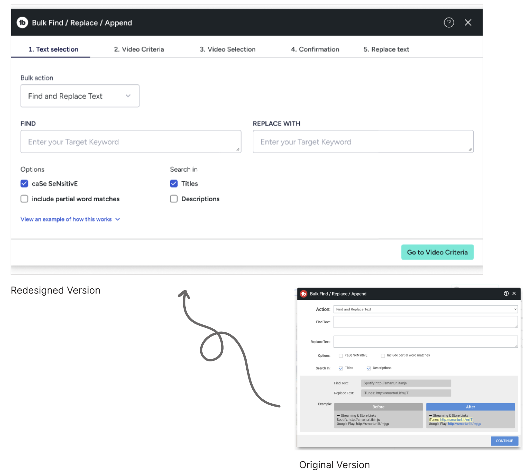
This tool was for bigger channels needing to update text on high volume videos where making the changes individually would take too much time. The tool required significant updates. The existing tool lacked modern features and a confusing user experience. Our goal was to revamp these elements to enhance visual delight and functionality.Our team conducted background research on the tool to estimate the scale of improvements needed. I added several key elements and I updated the overall styles, removed outdated visuals, and refined the UX. These adjustments ensured that user inputs and selections were immediately reflected, providing an intuitive preview of the final result.
Results: TBD
Small Improvements,
Large Results
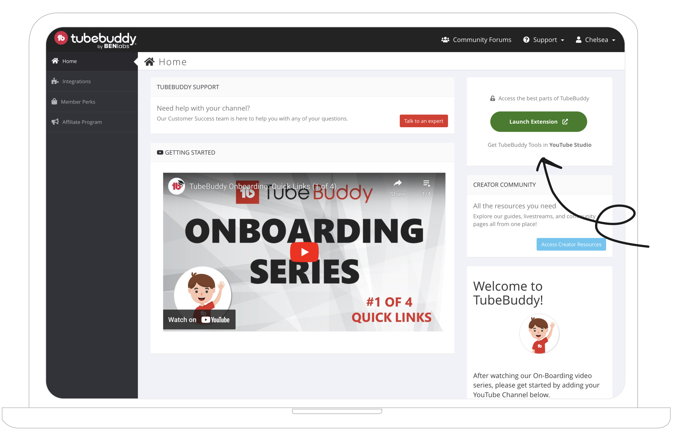
As an established company, we had significant potential for improvement through the use of analytics tools and A/B testing. Feedback from users indicated uncertainty in surprising areas of the extension. Leveraging these insights, we enhanced user awareness and engagement within the extension.
I designed and implemented a prominent button on an early stage of the customer journey. It served as a quick link to showcase the most powerful features. This simple change yielded remarkable results.
Results:
Significant lift in extension use. Large increase in free to paid users.
Reflections
Looking Back.
I'm grateful for the opportunity to improve a beloved YouTube tool for Influencers. Our team successfully adhered to the project scope and met all roadmap deadlines, while standing out as a model team. Despite the occasional challenge of balancing thoroughness with time constraints, our redesigns were delivered with minimal bugs and received positive feedback.Working on a redesign often yields a gradual yet substantial return. While the results may not be immediately visible, I observed improvements in customer loyalty, an increase in new users due to enhanced product trust, and overall positive user satisfaction from these changes.
Looking Forward.
Possible improvements include:- A broader range of initial user interviews with a targeted focus on identifying pain points.
- Experimental user funneling through notifications and nudges.
- Analytics specifically measuring the impact, providing valuable insights for future improvements.
- Embracing necessary pivots when pivots are needed.